...
- 下面所有方法为可选,增加附加特性
- 雷达图和饼图不需要设置X和Y轴信息,即不需要调用setXAxis和setYAxis
- 如果需要图例,每个都需要单独设置,调用setLegend
- 饼图只需要一个序列的数据
- setSeriesInfo(objectname,seriesInfo)。设置每一序列数据的信息(不包含数据)。适用于所有图形。seriesInfo为数组,其中每个元素属性如下:
- name属性:序列数据的名称。鼠标放在柱子上时,给名称会提示出来。另外,如果选择了显示图例,那么该属性也会显示在图例中。
- pkchart.setSeriesInfo("chart1",[{name: '用水量',type:"line"}]);
- pkchart.setSeriesInfo("chart1",[{name: '用水量',type:"bar"}]);


- type属性:数据显示类别,支持:bar/line
- itemStyle属性。每一个柱子显示的风格。如设置为渐变色,则:itemStyle:{color: new echarts.graphic.LinearGradient(0, 0, 0, 1,[{offset: 0, color: '#83bff6'},{offset: 0.5, color: '#188df0'},{offset: 1, color: '#188df0'}])}
- 示例:pkchart.setSeriesInfo("chart1",[{name: '用水量',type:"bar",itemStyle:{color: new echarts.graphic.LinearGradient(0, 0, 0, 1,[{offset: 0, color: '#83bff6'},{offset: 0.5, color: '#188df0'},{offset: 1, color: '#188df0'}])}}]);

- 本函数如果不调用,则图形不显示名字,且类型缺省为bar
- name属性:序列数据的名称。鼠标放在柱子上时,给名称会提示出来。另外,如果选择了显示图例,那么该属性也会显示在图例中。
setTitle:function(objectname,title,subtitle)。设定图表的标题和副标题,无返回值。适用于所有图表类型。不设置时将不显示标题,标题和副标题都可以不设置。
示例:pkchart.setTitle("chart1","深圳月最低生活费组成(单位:元)","From ExcelHome");
- 示例:pkchart.setTitle("chart1","深圳月最低生活费组成(单位:元)");
示例:不调用,不带标题

- setTooltip(objectname,tooltip)。设置鼠标放在图形后的提示信息,这是一个和X轴平行的虚线。适用于柱状图和折线图
- trigger属性,值:axis,意味沿X轴的虚线。这是也是缺省值。
- axisPointer属性,光标
- 子属性type,值: 'cross'表示显示,空字符串表示不显示
- 子属性crossStyle,定义颜色,值: {color: '#999'}
- 示例:pkchart.setTooltip("chart1",{"trigger":"axis","axisPointer":{"type":""}})不显示光标
- 示例:pkchart.setTooltip("chart1",{"trigger":"axis","axisPointer":{"type":"cross"}}),显示光标
- setLegend(objectname,legends)。设定图例显示哪些。适用于所有图表类型
- 和pkchart.setSeriesInfo("chart1",[{name: '用水量',type:"bar"}]);配合使用
- 某个图例必须:和每个序列的名字相同,或者和一个序列内部的每个值的名字相同。如果这个图例和两者都不相同,即使设置了也不会显示该图例
- data属性:数组,图例名称,如:['预算分配(Allocated Budget)', '实际开销(Actual Spending)']
- 示例:pkchart.setLegend("chart1",{data:["用水量"]});

- setToolbox(objectname,toolbox)。设置右上角工具栏的工具是否显示,显示哪些。适用于所有图表类型
- 示例:pkchart.setToolbox("chart1",{show:true})
- show属性:是否显示工具
- feature属性,可以定义显示具体哪些工具
- 示例feature: {
dataView: {show: true, readOnly: false},
magicType: {show: true, type: ['line', 'bar']},
restore: {show: true},
saveAsImage: {show: true}
} 
- 示例feature: {
- 示例:pkchart.setToolbox("chart1",{show:true})
- setRadar(objectname,radar)。设定雷达图显示哪些指示器。适用于雷达图类型
- shape属性。指示雷达图形状,有圆形和多边形。值可以为:circle或者无(多边形)
- name属性,设置雷达图上显示的名称的样式。textStyle:{color: '#FF0000',backgroundColor: '#999',borderRadius: 3,padding: [3, 5]}
- indicator属性。雷达图上有哪些指示器。必选。是一个数组
- 示例:pkchart.setRadar("chart1",{indicator:[{ name: '销售(sales)', max: 6500},{ name: '管理(Administration)', max: 16000},{ name: '信息技术(Information Techology)', max: 30000},{ name: '客服(Customer Support)', max: 38000},{ name: '研发(Development)', max: 52000},{ name: '市场(Marketing)', max: 25000}]});
完整示例。
- 需先将一个图表控件拖到画面上,命名为chart1,然后将下面脚本复制到画面的onLoad事件中需先将一个图表控件拖到画面上,命名为chart1,然后将下面脚本复制到画面的onLoad事件
- 完整示例1---基本柱状图:
- pkchart.setXAxis("chart1",[{type:"category"}]);
- pkchart.setYAxis("chart1",[{name:"水量"}]);
- pkchart.setSeriesData("chart1", [[2.0, 4.9, 7.0, 23.2, 25.6, 76.7, 135.6, 162.2, 32.6, 20.0, 6.4, 3.3]]);
...
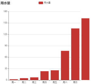
- 完整示例2--标题和图例、X轴分类:
- pkchart.setXAxis("chart1",[{type:"category"}]);
- pkchart.setYAxis("chart1",[{name:"水量"}]);
- pkchart.setSeriesData("chart1", [[2.0, 4.9, 7.0, 23.2, 25.6, 76.7, 135.6, 162.2, 32.6, 20.0, 6.4, 3.3]]);
- pkchart.setSeriesInfo("chart1",[{name: '用水量',type:"bar"}]);
- pkchart.setLegend("chart1",{data:["用水量"]});
- pkchart.setTitle("chart1","用水量");
- pkchart.setXAxis("chart1",[{data:['周一', '周二', '周三', '周四', '周五', '周六', '周日']}]);
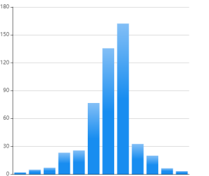
- 完整示例3--柱状图渐变效果:
- pkchart.setXAxis("chart1",[{type:"category"}]);
- pkchart.setYAxis("chart1",[{name:"水量"}]);
- pkchart.setSeriesData("chart1", [[2.0, 4.9, 7.0, 23.2, 25.6, 76.7, 135.6, 162.2, 32.6, 20.0, 6.4, 3.3]]);
- pkchart.setSeriesInfo("chart1",[{name: '用水量',type:"bar",itemStyle:{color: new echarts.graphic.LinearGradient(0, 0, 0, 1,[{offset: 0, color: '#83bff6'},{offset: 0.5, color: '#188df0'},{offset: 1, color: '#188df0'}])}}]);
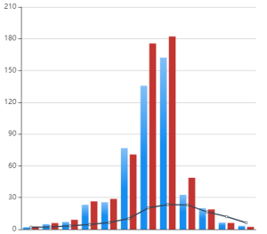
- 完整示例3–柱状图和折线图混合:完整示例3--柱状图和折线图混合:
- pkchart.setYAxis("chart1",[{name:"水量"}]); // 必须先设置Y轴,再设置X轴才可以,再给数据才可以
- pkchart.setXAxis("chart1",[{type:"category"}]);
- pkchart.setSeriesData("chart1", [[2.0, 4.9, 7.0, 23.2, 25.6, 76.7, 135.6, 162.2, 32.6, 20.0, 6.4, 3.3],[2.6, 5.9, 9.0, 26.4, 28.7, 70.7, 175.6, 182.2, 48.7, 18.8, 6.0, 2.3],[2.0, 2.2, 3.3, 4.5, 6.3, 10.2, 20.3, 23.4, 23.0, 16.5, 12.0, 6.2]]);
- pkchart.setSeriesInfo("chart1",[{name: '蒸发量',type:"bar"},{name: '降水量',type:"bar"},{name: '平均温度',type:"line"}]);
复杂效果示例图:
var XAxis=[
{
type:"category",
data:['周一', '周二', '周三', '周四', '周五', '周六', '周日'],
axisLabel: {
textStyle: {color: '#a2d4e6'
}
},
axisTick: {
alignWithLabel: true
}
}
]
pkchart.setXAxis("chart1",XAxis);
var yAxis= [
{
type: 'value',
name: '三舱人数',
axisLine: {
lineStyle: {
color: '#a2d4e6'
}},
splitLine: {
show: true,
lineStyle:{
color: ['#05133c'],
width: 1,
type: 'solid'
}
}
// axisLabel: {textStyle: {color: '#fff'}}
},
{
type: 'value',
name: '总人数',
axisLine: {
lineStyle: {
color: '#a2d4e6'
}},
splitLine: {
show: true,
lineStyle:{
color: ['#05133c'],
width: 1,
type: 'solid'
}
}
}
]
pkchart.setYAxis("chart1",yAxis);
pkchart.setLegend("chart1",{orient: 'horizontal',top:10,right:0,textStyle:{color:'white'},data: ['电力舱', '综合舱', '燃气舱','人数']}); // 设置图例
var series= [
{
name: '人数',
type: 'line',
yAxisIndex: 1,
color:'#44f0ff',
areaStyle: {
normal: {
color: new echarts.graphic.LinearGradient(0, 0, 0, 1, [
{ offset: 0, color: "#6fecf7" },
{ offset: 0.5, color: "#8eecf5" },
{ offset: 1, color: "#eef2f2" }
])
}
}
},
{
name: '电力舱',
type: 'bar',
barWidth : 10,
itemStyle:
{
color: new echarts.graphic.LinearGradient(0, 0, 0, 1,[{offset: 1, color:'#ff5b1f'},{offset: 0.5, color: '#ff861f'},{offset: 0, color:'#ffbe20'}])
}
},
{
name: '综合舱',
type: 'bar',
barWidth : 10,
itemStyle:
{
color: new echarts.graphic.LinearGradient(0, 0, 0, 1,[{offset: 1, color:'#048aef'},{offset: 0.5, color: '#19b8ec'},{offset: 0, color:'#27d4e5'}])
}
},
{
name: '燃气舱',
type: 'bar',
barWidth : 10,
itemStyle:
{
color: new echarts.graphic.LinearGradient(0, 0, 0, 1,[{offset: 1, color:'#fef901'},{offset: 0.5, color: '#fbf529'},{offset: 0, color:'#f7f14f'}])
}
}
]
pkchart.setSeriesInfo("chart1",series);
pkchart.setSeriesData("chart1",[[29.0, 24.9, 27.0, 33.2, 25.6, 26.7, 25.6],[2.0, 4.9, 7.0, 13.2, 15.6, 26.7,15.6],[7.0, 9.9, 25.0, 22.2, 3.6, 14.7, 27.6],[15.0, 2.9, 9.0, 23.2, 2.6, 23.7, 1.6]]);
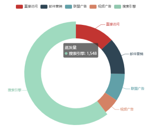
- 完整示例–饼图图示例:完整示例--饼图图示例:pkchart.setTooltip("chart1",{trigger: 'item'}); // 设置提示
- pkchart.setLegend("chart1",{data: ['直接访问', '邮件营销', '联盟广告', '视频广告', '搜索引擎']}); // 设置图例
- pkchart.setSeriesInfo("chart1",[{name: '蒸发量',type:"pie",radius: ['50%', '70%']}]);
- pkchart.setSeriesData("chart1", [[{value: 335, name: '直接访问'},{value: 310, name: '邮件营销'},{value: 234, name: '联盟广告'},{value: 135, name: '视频广告'},{value: 1548, name: '搜索引擎'}]]); //注意数据格式
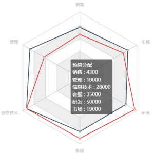
- 完整示例--雷达图示例:
- pkchart.setTooltip("chart1",{}); // 设置提示
- pkchart.setLegend("chart1",{data: ['预算分配(Allocated Budget)', '实际开销(Actual Spending)']}); // 设置图例
- pkchart.setRadar("chart1",{indicator:[{ name: '销售', max: 6500},{ name: '管理', max: 16000},{ name: '信息技术', max: 30000},{ name: '客服', max: 38000},{ name: '研发', max: 52000},{ name: '市场', max: 25000}]});
- pkchart.setSeriesInfo("chart1",[{name: '预算 vs 开销(Budget vs spending)',type:"radar"}]);
- pkchart.setSeriesData("chart1", [[{value: [4300, 10000, 28000, 35000, 50000, 19000],name: '预算分配'},{value: [5000, 14000, 28000, 31000, 42000, 21000],name: '实际开销'}]]); //注意数据格式
专有事件
- onChange事件。当鼠标点击某个柱子时,触发onChange事件。参数:objectname,value。其中value包括:value,name等
...